You’ve spent hours perfecting a magazine layout — sharp typography, immaculate grid. Then you upload a flat screenshot to Dribbble and it lands with a thud. No likes, no inquiries.
On visual platforms, how you present work matters as much as the work itself. That’s exactly where the magazine mockup becomes your secret weapon.
Why Presentation Is Half the Battle
Recruiters and clients scroll fast. You have two seconds to stop their thumb. A polished mockup signals professionalism before they read a word of your case study.
When a viewer sees your layout wrapped around a tactile cover — resting on a marble surface or held open mid-read — they stop imagining and start believing. That shift is what turns a portfolio view into a project inquiry.
Choosing the Right Mockup for Your Context
Not every mockup suits every project. Before dropping your design in, consider:
- What story are you telling? A luxury editorial brand needs soft light, airy surfaces, and neutral backdrops. A bold street-culture magazine calls for higher contrast, raw texture, and a grittier environment. Let the brand’s DNA guide the scene.
- Does the angle serve the design? A straight-on flat lay shows your full cover without distortion — great for typography-heavy work. A three-quarter perspective adds dynamism and depth, but may crop key details. Spreads and open-book mockups work best when the interior layout is the hero.
- Who is your audience on that platform? Dribbble rewards visually striking, scroll-stopping hero shots — go bold with your first image. Behance case studies allow more breathing room, so you can layer multiple mockup angles to build a narrative from cover to interior to final product.
- Does the environment match the content’s world? A wellness magazine lives on linen and soft morning light. A finance publication feels credible on a clean marble desk with minimal props. Don’t drop a nightlife magazine cover into a cozy bookshelf scene — the disconnect breaks the illusion immediately.
- Are you showcasing one piece or a system? If you’re presenting a single cover, one strong hero mockup is enough. If you designed a multi-issue series or brand system, stack and spread mockups let you show scale and consistency — which is often what bigger clients are actually evaluating.
Matching the mockup’s mood to your design’s personality separates a compelling portfolio piece from a forgettable one. The right choice doesn’t just display your work — it amplifies it.
Real Examples: Magazine Mockups Working in the Wild
Case 1 — The Editorial Rebrand. A designer rebranding a European fashion magazine used open-spread mockups to walk viewers through interior layouts. Spreads appeared on a light oak desk with soft morning light — communicating a premium feel immediately. The Dribbble project earned 3,200+ appreciations and led to two direct client inquiries.
Case 2 — The Student Portfolio Breakthrough. A recent graduate presented a thesis publication using angled stack mockups showing multiple issues of the same title. The depth communicated brand consistency — something flat exports can’t convey. Two agency recruiters commented specifically on the quality of the presentation.
Case 3 — The Agency Case Study. A studio combined close-up detail shots with wide environmental mockup scenes across a Behance project. The variety of angles told a narrative arc: cover, interior, magazine in the world. Client conversion from that page was measurably higher than their previous flat-only projects.
In every case, the mockup wasn’t decoration — it was narrative infrastructure.
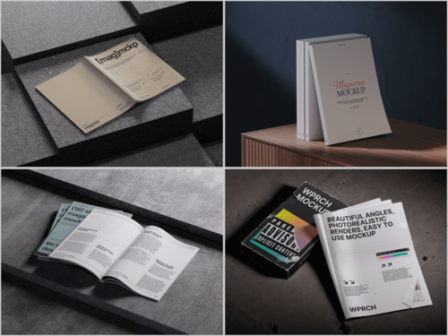
Magazine Mockups on ls.graphics: Premium Quality That Shows
When sourcing mockups for editorial work, ls.graphics offers one of the strongest collections available. Their magazine mockup lineup stands out for ultra-realistic rendering — paper texture, natural light falloff, and ink depth so convincing your design feels genuinely printed, not composited.
The practical side is just as strong: organized layers make swapping your artwork frictionless, a wide range of angles covers everything from flat lays to dramatic perspectives, and multiple color styles let you match the environment to your project’s tone. The stylish, minimalistic compositions frame your work without competing with it. Drop in a smart object, adjust if needed, export — and what comes out looks like a professional product photo.
Building a Smarter Portfolio Strategy
Effective mockup use is about intention, not volume. Lead with your strongest mockup as the project thumbnail — it’s the only image visible during a scroll. Follow with flat exports for clarity, use environmental shots to build narrative, and close with detail crops showcasing typographic decisions.
When your mockup environments share similar light quality across projects, your portfolio reads as a coherent body of work.
Conclusion
Great design deserves great presentation. Magazine mockups are one of the most powerful and underused tools in a portfolio designer’s toolkit — not because they mask weak work, but because they give strong work the stage it deserves. Quality resources like ls.graphics make that investment fast and accessible.
Your work is already good. Now let it look like it.